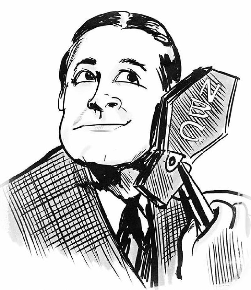
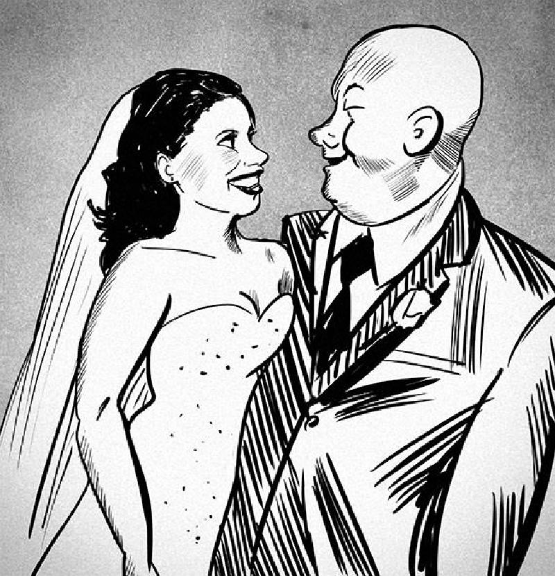
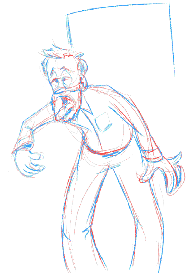
When I can’t think of anyone else to draw!
This time it’s friends of my sister, but strangers to me.
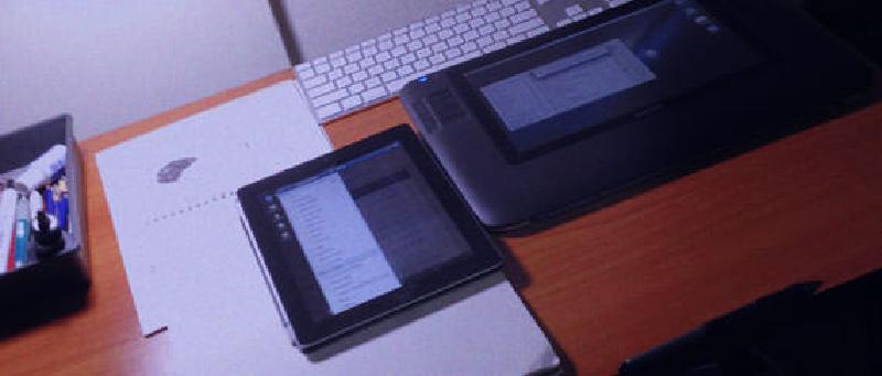
The good news is, my setup is coming together. The bad news is, after I installed my wifi card, I basically had to start the OS install from scratch.
Still easier than Windows on a good day.
The nerdy and artistic sides of my brain are always trying to negotiate peace, and for the sake of diplomacy they’ve been racking themselves to find new and exciting ways to broker progress.
A few weeks ago, in an effort to encourage drawing with less distraction, I set up a small desk on the opposite side of my apartment, as far away from the computer as possible, and facing away from it.
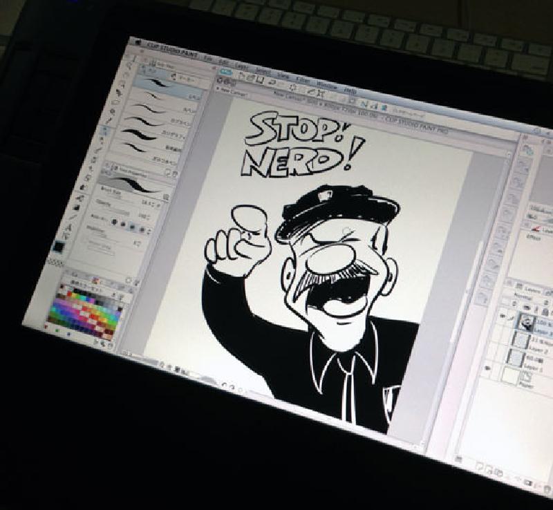
But, as you may have noticed, my drawing output hasn’t increased, and most of my drawings have been created in digital form. This means, of course, that I remain tethered to my computer–the very same machine that’s oozing a constant flow of highly distracting information and artistry from across the globe.
I knew I wanted to do my digital drawing at my designated drawing table, but it took me a while to figure out how to accomplish it. The solution: Hackintosh!
Since the majority of my readers aren’t total nerds, nor do they aspire to be, the simplest explanation of a “Hackintosh” is that it’s a computer that runs Apple software, but doesn’t require expensive Apple hardware. For several years, nerds have been gathering online to share their knowledge about choosing compatible parts and installing the software correctly. Consequently, building a Hackintosh has evolved from a dicey, frustration-prone endeavor to an exercise in correctly following half a page of simple instructions.
Once I learned about a small box called the Intel NUC, I knew I’d found my solution. It’s completely compatible with OS X Mountain lion out of the box.

Once I finish configuring it, I’ll tuck this ridiculously tiny box, sans Internet, underneath my drawing desk, wire it up to my Cintiq tablet, and do all my artwork–analog, digital, and macaroni–over there.
Tomorrow I’ll tidy things up and show you the finished workstation. And then we’ll hold our collective breath and see if I actually become more prolific.
Sometimes I get home from my ridiculously easy job and think I must have some sort of chronic malady, because I’m in a weary fog and too tired to draw. And then, while I’m in the middle of sketching out my periodic interpretation of this feeling, I suddenly remember that I only slept three hours last night. And probably the night before that. Oh, and my diet runs the gamut from hot dogs to burritos to spoons full of peanut butter (somehow scooped to the size of an apple and eaten ravenously over the sink).
In other words, I’m exhausted by my swingin’ bachelor lifestyle. It’s probably exactly the same for George Clooney.
