Request from a coworker, and possibly the most important thing I did at work last week.
Request from a coworker, and possibly the most important thing I did at work last week.
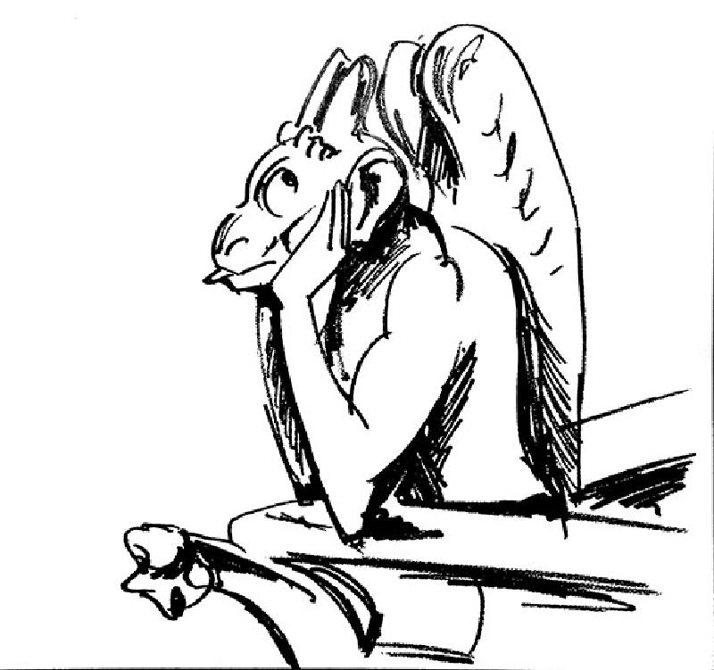
Today’s @sketch_dailies prompt on Twitter: Gargoyles! This one is based on a real Notre Dame denizen.
I have mixed feelings about Sketch Dailies. As you probably know, my renewed interest in art has been predicated on not competing with anyone but myself. But this Twitter account has exposed me to some incredible artists, and it can be a little intimidating to see what they consider a “sketch.” Every publicized drawing seems to be a finished illustration.
There are two possibilities, and they’re both frightening: Possibility 1, these are actually what a professional artist considers a sketch, and it only took them 15 minutes to create something that would take me a couple days. Possibility 2, these took them at least a day, and were made possible by a lack of demand for paid work.
Honestly, possibility 2 is worse, because it means that illustration may be a dead-end pursuit. Possibility 1 is better; it just means I need to improve. Which I already knew.
Here are some examples of “sketches” that look to me like finished illustrations.
@Sketch_Dailies #sketch_dailies loved drawing #Disney #Gargoyles today! #Goliath is so badass!!! pic.twitter.com/eBF8XpwUsZ
— Anthony Vu (@antzvu) May 28, 2014
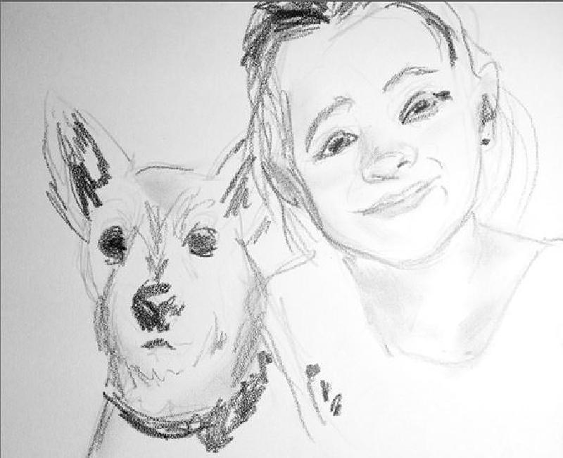
Sketch kids and dogs.
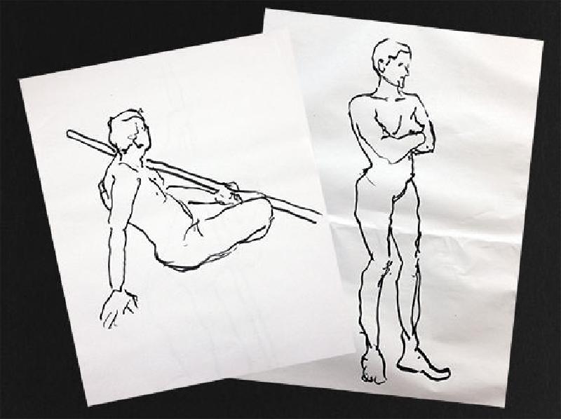
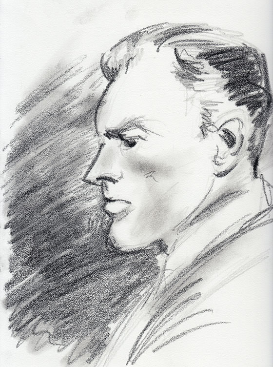
My drawing output has been notably lackluster over the last few weeks, but I was looking at some recent sketches and decided they were, if nothing else, worthy of some commentary.
First, there’s a reason the figure drawings above look a little shaky. About a month ago, my art teacher took a spill on the sidewalk and broke her right arm. As she recuperated, she couldn’t fathom not drawing, so she began using her left hand. Upon her return to class, inspired by this experience, she introduced a new exercise: 3-minute poses with our non-dominant hands.
I think what surprised me, and all the other students, was that our drawings were surprisingly accurate. In fact, shakiness aside, my proportions in these left-handed sketches might be better than those in most of my right-handed ones. How could that be?
My theory (disclaimer: despite the pale skin, I am not a scientist) is that when drawing with my dominant hand, I rely too much on memory, muscle and otherwise, and not enough on seeing. It takes a lot of concentration to accurately gauge the contour of a person or object in front of you. When concentration slips, you begin taking shortcuts. Your jerk brain says to your arm, “Okay, head goes here. You’ve drawn SO MANY heads! Piece of cake.” And so you end up drawing a head, but not the head in front of you.
But unless you’re one of those nudniks who brags about being ambidextrous, drawing with your “other” hand is completely different. Your brain has no practical experience in taking shortcuts with this hand. The most practical way to guide your hand clumsily across the page is to let your eyeballs take the lead. Like a human pantograph, you move your gaze over the contour of the object you’re drawing, and move your hand to match.
Of course, there’s a lot more to good drawing than contour, but I think for amateurs like me, it can be the hardest aspect to grasp, because it’s the one part of the process that is diminished by conscious thought. Anatomy, shading, composition–these are all things that are OK to think about. But contour and measuring? It really is best left to your eye and your hand.
Wow, I didn’t think I was going to babble so incessantly about this topic. Your reward for making it this far is another underwhelming sketch!
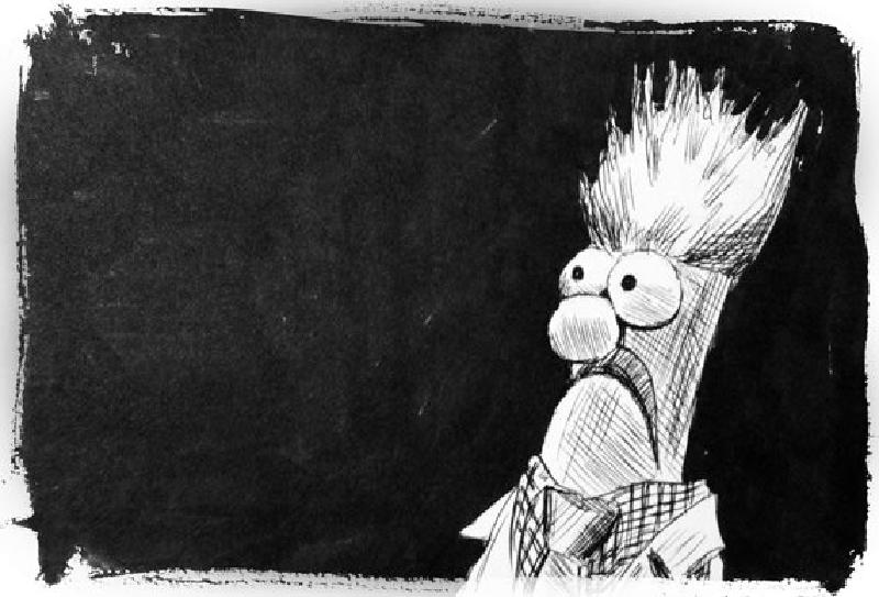
The reason I was unhappy with this sketch is that it was supposed to be a certain celebrity, but it ended up looking nothing like him. Don’t even try to guess. It looks NOTHING like him.
But I can say a couple positive things about it. First, I kinda like this style of drawing and want to explore it further. And I really love the textured paper I drew it on.
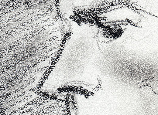
A lot of cartoonists have used this type of paper as an alternative to using halftone dots for shading. Because pencil and even ink is laid down in this coarse speckled pattern, it was perfect for old-school newspaper engraving methods.
Bet you’re glad you stuck around for that bit of trivia. Till next time!
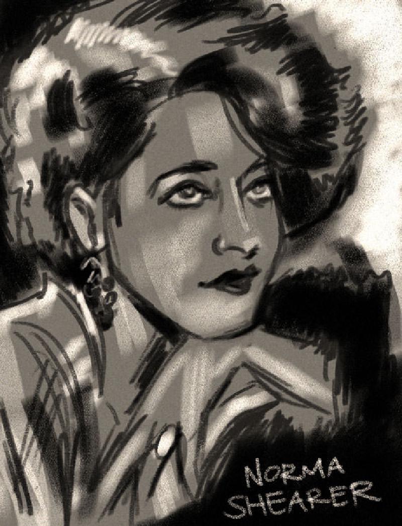
Recovery from the flu means lots and lots of old movies. Here’s a sketchy attempt at 30s star Norma Shearer.
